Warm naive paint memory split
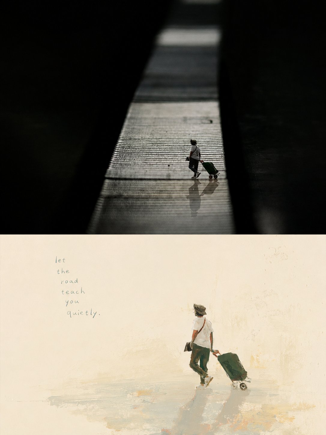
3:4 split: real photo on top, loose warm gouache memory of the core subject below.
xiaoxiaodong01 / August 25, 2026
1 / 4
Prompt
Please turn each uploaded photo into a separate high-end design poster. Do not combine multiple images. Output each photo individually.

Use a 3:4 vertical composition with an upper/lower double-layer logic: the upper half is real photography; the lower half is a painterly extraction of the original’s core imagery. Together they echo reality and memory.

## Upper half

Keep the original photograph. Preserve subject identity, structure, posture, authentic texture, natural light and shadow, and the original color atmosphere. Apply only light high-end photographic color grading so it feels like art magazine, independent publication, and exhibition photography. To fit the frame, the environment may be naturally extended, but do not stretch, distort, or alter the main subject.

## Lower half

Extract the most recognizable **subject, silhouette, posture, and narrative relationship** from the photo. Decide the core theme, visual metaphor, or aesthetic relationship that makes the image work, and keep only that layer of information worth remembering. Do not fully replicate the scene, do not chase background fidelity, and do not convert every object into an illustration. Actively delete irrelevant environment and clutter; leave one core subject and only the few relationships that truly belong to the story, so the frame feels like a reorganized visual memory.

Use an **extremely light background and large negative space** as the main field. Background color is not fixed: match a near-white, very light composite tint from the photo’s overall color temperature and mood — slightly warm, slightly cool, or with a faint hue — but it must stay light, clean, and quiet. Emptiness itself carries air, distance, time, and emotion so the subject can breathe.

Composition emphasizes **visual center of gravity, scale, negative space, directional tension, and imperfect symmetry**. The subject may be offset, partially cropped, suspended, or placed low. Build beauty through size contrast and wide blank fields. If what is truly moving is a person-and-space, object-and-environment, distance between two figures, or some accidental relationship, prioritize that relationship over drawing the object alone.

Painting language is relaxed, slightly naive, and artistic: **opaque gouache, acrylic, pastel, and dry oil textures**, using summarized color blocks, hand-drawn contours, local scraping, overpainting, and incompletely filled strokes. Forms may be a little clumsy with mild proportion exaggeration, but subject identity and key posture must stay accurate. Keep real painting pauses, revisions, underlayers, and accidental marks — avoid overly smooth polish.

## Color

Pull overall temperature and the most alive colors from the photo, then translate them into a **warm, bright, slightly naive artist palette**. Overall use cream yellow, apricot, soft orange, coral pink, old rose and similar warm blocks against sky blue, light teal, mint, and gray-green cools in a loose warm/cool collision. Allow tiny amounts of brick red, orange-red, deep green, earth brown, or black as anchors. Colors need not obey real objects; local recoloring, wrong colors, and jumps are fine if the whole stays harmonious. Blocks should feel powdery, opaque, slightly faded yet still vivid. Avoid full Morandi greying, uniform pastel filters, dirty browns, and high-saturation digital color.

## Type

Do not preset fixed titles, places, numbers, or languages. From the photo’s theme, action, environment, mood, sound, memory, or metaphor, freely generate a very small amount of truly meaningful words, phrases, or fragments. Type may enter the white space like part of the painting, sit near the subject, follow spatial direction, and keep a little handwriting, misalignment, or irregularity. Stay restrained — do not add information just to “look like a poster.”

## Overall

Pursue **very light background, huge white space, few subjects, vivid warm color relationships, naive hand-painted feel, and a clear visual metaphor**. Quiet but not bland, healing but not syrupy, artistic but not pretentious — like an independent publication painted by hand. Avoid full-scene replication, filled backgrounds, object inventories, uniform pastel filters, polished commercial illustration, smooth vectors, cartoon templates, and meaningless extras added only for richness.