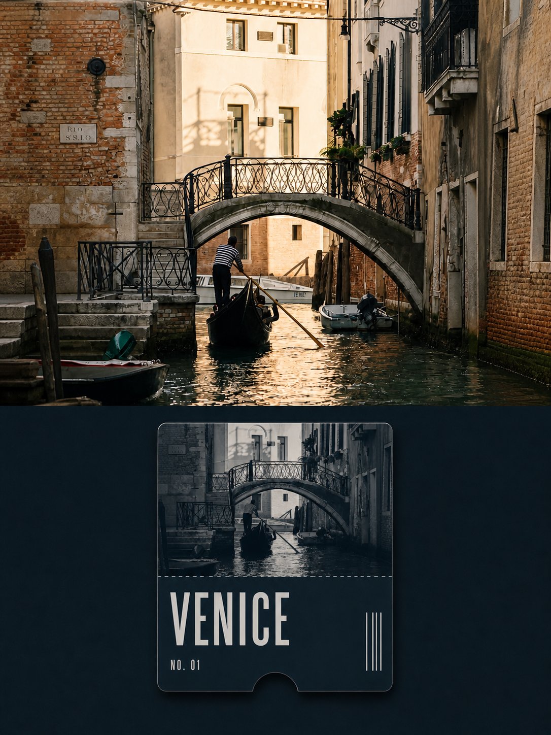
Monochrome collectible ticket split
3:4 split: full-color travel photo above, single monochrome collectible ticket card below.
Hamburgerai / August 25, 2026
1 / 4
Prompt
Please turn each uploaded travel photo into a separate high-end design poster. Do not make multi-image collages. Output each photo individually.

Use a 3:4 vertical composition divided into two clear comparison regions at about 1:1. Separate upper and lower with a straight, clear, restrained horizontal boundary — no gradients, feathering, torn paper, or overlapping.

## Upper half

Fully present the original travel photograph. Accurately keep subject identity, count, posture, architecture, terrain, viewing angle, spatial relationships, real materials, natural light and shadow, and the original color atmosphere. Apply only light high-end travel color grading and very thin film grain. The upper half must stay natural full color and real photography — no early monochrome, no illustration, and no tickets, titles, borders, or icons. Environment may be naturally extended to fit the frame, but do not stretch, mirror, duplicate, move, or change the main subject.

## Lower half

From the photo, choose one hue that best carries the place’s character — for example sea blue, forest green, brick red, stone gray, dusk amber, or winter blue-gray — and use it as a restrained monochrome matte paper field. In the center of the lower half, place a single slender vertical rounded collectible ticket card. Width about 46%–58% of the lower region, with wide empty margins around it. Keep the card level, front-facing, unrotated.

The ticket has slight but real matte cardboard thickness, tiny edge highlights, and a short contact shadow. At the exact center of the bottom edge, cut a semicircular ticket notch that truly changes the outer silhouette. The upper portion of the ticket is about 58%–66% of card height and uses the **same real photograph** as above, with complex color compressed into a high-end monochrome or duotone within that single hue. Keep real photo texture, spatial depth, subject structure, and photographic light/dark — do not turn it into illustration, silhouette, or a generic vintage filter.

The lower portion of the ticket is a pure matte information panel in the same color family, separated from the photo by one extremely fine short dashed or perforated line. Place only a reliable place name as the main title; optionally one neutral number such as “NO. 01”. Use sturdy but restrained modern condensed sans-serif type. Lower right may hold a few non-scannable vertical registration stripes — no real barcodes, QR codes, or URLs.

## Overall

Clearly show the same travel scene translated from **natural full-color photo** to **monochrome collectible ticket**, like a design-study page in a travel publication. High-end, restrained, modern, quiet, with ticket-archive and collectible character.

Hard avoid: missing upper full-color photo, upper photo monochromed, mismatched upper/lower scenes, ordinary photo plus text, multiple tickets, ticket stuck to edges, boarding pass, airline branding, passport page, credit card, phone UI, tourist stamps, QR codes, scannable barcodes, invented places or dates, logo, author name, photographer name, signature, watermark, glossy plastic, metal foil, neon gradients, desktop or hand-held mockup.