Duotone cultural landmark editorial
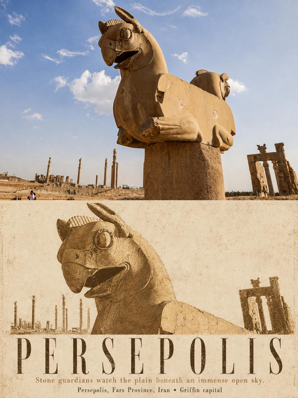
3:4 split poster: faithful travel photo on top, two-ink silkscreen landmark edit on aged paper below.
Hamburgerai / August 24, 2026
1 / 4
Prompt
Please turn each uploaded travel photo into a separate high-end design poster. Do not combine multiple images. Output each photo as its own poster.

Use a 3:4 vertical composition with two clear, substantial regions. The upper half is about 48%–52% original photograph; the lower half is about 48%–52% a duotone cultural-landmark editorial reinterpretation of the same scene. Separate the two halves with a completely straight, clear, restrained horizontal boundary — no feathering, tearing, or bleed. Architecture and type must not cross the divide.

## Upper half

Keep the original photograph itself — do not redraw it. Accurately preserve landmark identity, viewing angle, main structure, tower or dome relationships, roof heights, arch and window rhythms, spatial relationship between building and surroundings, real materials, natural light and shadow, and the original color atmosphere. Apply only light high-end photographic color grading and a very thin film grain so it feels like architecture-magazine, art-publication, and exhibition photography. To fit the frame, natural crop or careful extension of sky, ground, and surroundings is allowed, but do not stretch, distort, mirror, move, delete, or invent the main subject.

## Lower half

On warm off-white, light oat, or ivory aged paper, remake the same landmark as a high-contrast two-color silkscreen / coarse-grain print editorial poster. Use strictly two matte spot inks extracted and reduced from the current photo, plus the paper color. Do not add a third colored ink. The first spot ink carries architectural darks, structure lines, and the main title; the second carries lit surfaces, local building color, vegetation, or secondary fields.

First understand the key structure that defines the landmark’s identity, then reorganize scale, crop, negative space, and visual center in the lower half. Do not copy the upper photo’s original composition and proportions and simply add a halftone filter.

Based on the most recognizable structure of the landmark, actively choose a more powerful second composition: enlarge rose windows, domes, spires, roof clusters, continuous arcades, facade rhythm, or bridge skeletons; allow parts to leave the frame edge; delete or compress trees, plazas, water, and distant views into a few halftone darks. The building must still be instantly recognizable, but the lower half must clearly differ from the upper photo in subject scale, cropping, background density, or spatial organization.

Keep about 28%–45% continuous aged-paper white space so the architectural print, title, and empty field form a publication layout together. Paper white between continuous arches, window grids, and towers should work as important negative shape — do not fill the whole background.

Use real two-color silkscreen, old print, and cultural-publication texture:

coarse controlled halftone dots, dry ink, ink starvation, uneven pigment coverage, chipped carved edges, rough paper tooth, exposed paper fibers, slight registration drift, small offset ink fringes, broken linework, matte pigment.

Halftone density must truly shape the building’s depth, light, and material — not a uniform filter over a photo. Slight misregistration, missing ink, scuffs, and paper show-through are allowed, but they must not destroy the landmark outline or become glitch art.

## Typography (lower half)

Add a restrained, accurate English type group. Main title = the real place or landmark name from the photo, preferably 1–3 English words, in oversized, high-contrast, condensed editorial serif with open tracking, forming a second visual spine with the architecture.

Under the title, one short English observation sentence drawn from the current structure or atmosphere, then one real place / building-type line. All text must be letter-accurate and clearly readable, as if printed into the paper with the same spot inks — slight missing ink, paper tooth, and natural registration error — not floating digital type layers.

Generate only the text the prompt asks for. Do not add author name, signature, brand, URL, QR code, invented years, long history, fake Chinese, gibberish, or meaningless numbers. If information cannot be confirmed, omit it.

## Overall

Reference international architecture studios, museum cultural publications, independent travel magazines, historical landmark archives, and collectible silkscreen posters. Restrained, quiet, commemorative, tactile, with clear cultural identity and layout impact.

Avoid: missing source-photo comparison, tiny source thumbnail, full-poster redraw, same composition with a simple filter, generic landmark silhouette, altered architecture, invented cultural symbols, third spot color, ordinary duotone photo filter, uniform halftone overlay, clean vector tracing, smooth digital gradients, glossy 3D, watercolor wash, full background coverage, typography overload, fake Chinese, author name, signature, logo, watermark, gibberish.

Most important: the upper half must be a high-fidelity real photo you can compare against; the lower half must be the same landmark after active extraction, re-cropping, and re-layout as a two-color architectural print. Do not only change material — use the landmark’s most recognizable structure to create new visual force, and let accurate small type grow into the paper like ink.