Ink-line architecture observation
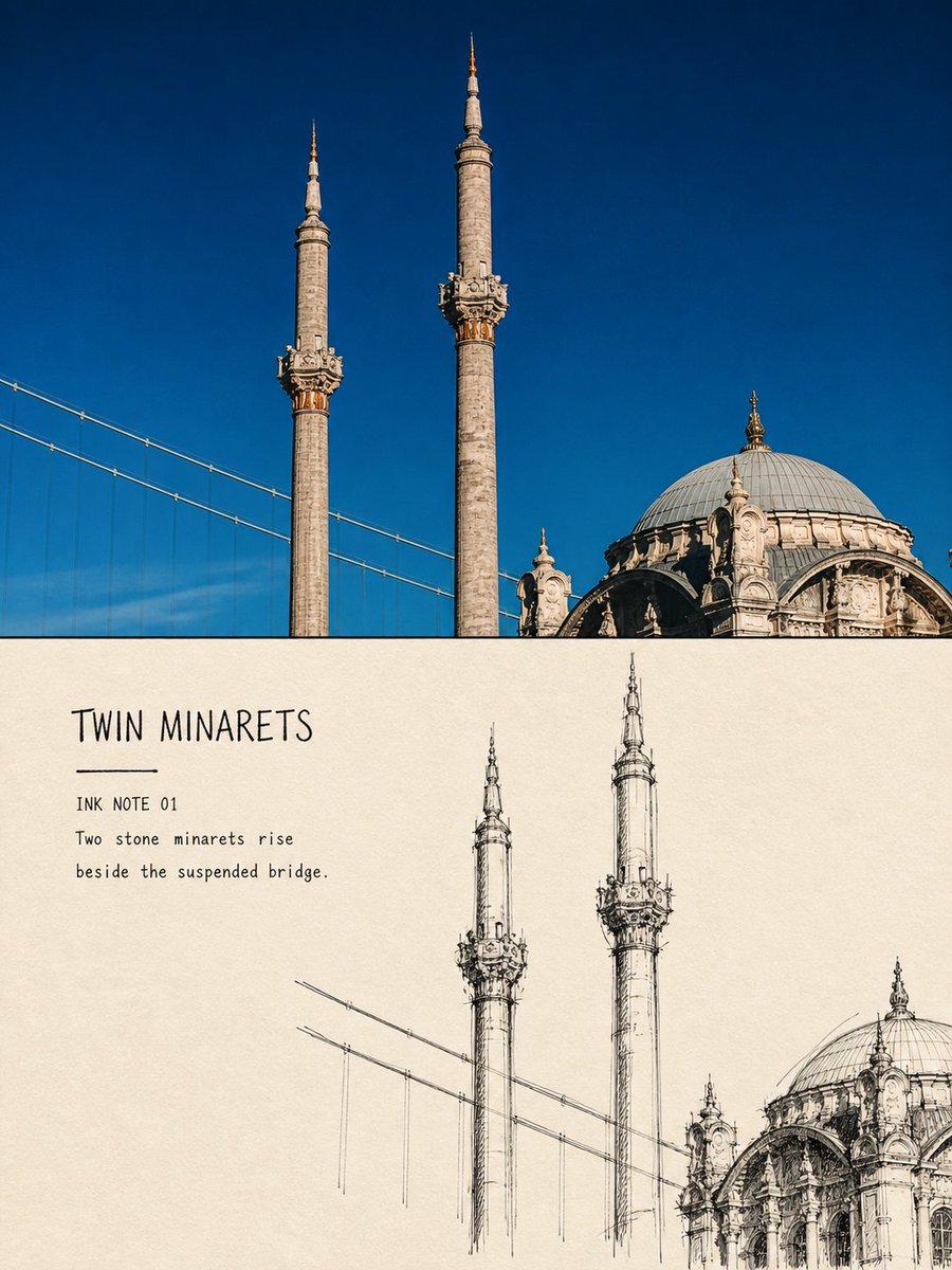
3:4 split: faithful travel photo above, unfinished black-ink field sketch of the same building below on warm paper.
Hamburgerai / August 31, 2026
1 / 4
Prompt
For each travel photo I upload, make one independent “ink-line architecture observation” editorial poster. Do not collage multiple photos. Output one poster per photo.

Overall composition: 3:4 vertical.

Top: keep a substantial area of the original photograph. Preserve building identity, story count, proportions, domes, towers, eaves, column grids, arches, roads, water edges, people, and spatial relationships accurately. Only apply light art-publication color grading and a very thin film grain. Do not stretch, move, reshape, or turn the photo subject into illustration.

Bottom: warm natural off-white sketch paper. Actively shrink, delete, and reorganize the same building from the photo into an unfinished fast black-ink architecture field study. Do not fully recreate the photo background. Keep only the main contours that fix place identity, the main axis, roof or spire, opening rhythm, and one to three necessary direction lines for roads, bridges, water edges, or tree shadow.

Draw with black fountain pen, technical pen, and a small amount of dry brush tip. Contours should show repeated searching and correction: overlapping lines, double outlines, hand shake, pauses, broken ink, overshoots, and unerased trial marks. Use urgent vertical strokes to establish the column grid; use short dense hatching only at structural joints. Concentrate black density on a few key nodes — do not fill the whole building evenly.

The architecture sketch should occupy about 45%–65% of the lower area width and 38%–58% of its height, and may bias to one side. Leave at least 40%–55% continuous intact paper white. Lines should stop naturally on the paper: edges clear but unfinished. No digital feathering, soft focus, or regular rectangular picture frame.

Lower half: paper white and carbon black ink only. No watercolor, gray washes, colored lines, or fixed accent colors.

Add a little text based on photo facts:
- main title of 1–3 English words
- field “INK NOTE 01”
- one on-site observation of 5–10 English words

Keep text in continuous paper-white areas, using narrow lead type or plain handwriting with ink soak and slight notches; optional short ink rule. The title must stay clearly readable at normal preview size — never shrink into decorative gray lines.

Overall feel: an architect or travel sketcher standing on site quickly finding structure — sharp, urgent, restrained, incomplete, still accurately holding the building’s character.

Avoid: photo outline filters, CAD drafting, even fine hatching, academic steel-pen finish, full-page dense lines, complete backgrounds, transparent watercolor, gray washes, colored washes, soft edges, same-composition tracing, unreadable micro type, author name, signature, logo, QR code, and watermark.