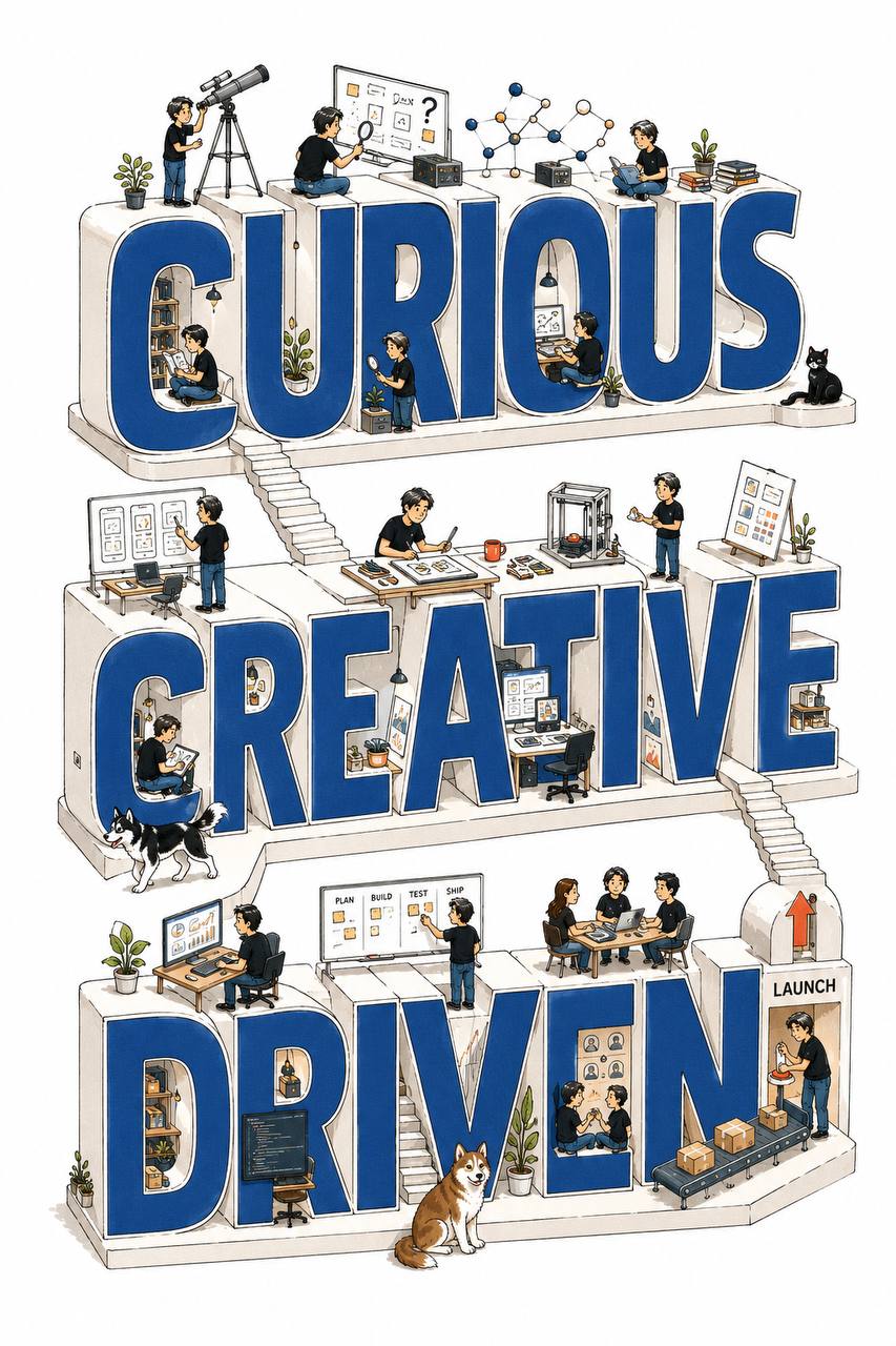
Giant type miniature world poster
Turn any person, brand, or product into a 4:5 ad poster of giant 3D type with tiny people working inside.
ミヤマ / August 22, 2026
1 / 4
Prompt
Using the attached screenshots, images, profile, posts, product info, text, URL, or other materials as source material, generate one vertical 4:5 advertising poster that expresses that person, brand, or activity as giant dimensional typography plus a miniature world of tiny people.

Even if the input is messy, organize the content internally and edit it into the most compelling visual.

Do not output clarifying questions, analysis, explanations, or copy drafts. Generate the finished image directly.

## Primary goal

Turn the giant words themselves into buildings and workplaces, with tiny people active on and inside them — a fun, intelligent advertising poster.

From a distance, the large dimensional letters communicate the theme instantly.

Up close, the tiny people, tools, events, and small stories can be discovered one by one.

Design so someone viewing on a phone stops and thinks:

- “What is this?”
- “Cute.”
- “What are they doing?”
- “I want to look at the details.”

Do not simply place people around 3D letters. Make it feel as if the world of that person, brand, product, or activity exists inside the giant words.

## Organize internally first

From the materials, organize:

- Who or what the ad is about
- Products, services, or activities offered
- The single most important theme to communicate
- A short phrase that symbolizes the theme
- Work or processes that actually happen
- Related people, tools, places, products
- Colors that fit the world
- The impression you want viewers to keep

You do not need to use every piece of information.

Select only what the subject needs, and merge similar content.

Do not invent biographies, products, services, features, achievements, numbers, or reviews that are not in the materials.

If information is missing, do not invent facts. Build with general work scenes, tools, abstract motifs, and negative space.

## Handling input images

Do not paste attached photos, profile images, illustrations, icons, avatars, or mascots directly into the design.

Do not enlarge, trace, copy, cut out, or rearrange the source images.

Use input images only as reference for meaning, traits, color, and role of people or motifs.

Reinterpret every person, animal, product, and prop as a unified miniature illustration made for this poster only.

Do not mix illustration styles that differ from the source image’s style into the final.

## Converting people

Whether the attachment is a real photo, a character illustration, or a profile icon, convert them in the final image into small people drawn in the same style.

Do not use photos as-is, and do not place giant portrait photos or large face illustrations.

Keep only the features needed for recognition — hairstyle, glasses, clothing color, occupational feel — in a simple way.

Prioritize making the person’s job and role readable from pose and action over detailed caricature of the face.

Unify every person with the same line weight, proportions, color count, and level of detail.

If the same person appears in multiple places, do not clone the same pose; give each scene a different natural action.

## Converting animals and characters

Even if the attachment includes animals, characters, mascots, or animal icons, do not use those drawings as-is.

Using the original traits as reference, redesign them as small hand-drawn line-art animals that match this poster.

Avoid giant animals, giant faces, large mascots bursting out of the type, or repeating the same animal or character in a row.

Use animals or characters only sparingly when the subject needs them. Do not add more just because they are cute.

## Converting products and props

Convert product photos, buildings, tools, plants, and similar items into miniature illustrations in the same style — never paste photos.

Preserve product shape and key traits while making them function naturally in the world: held, used, assembled, or displayed by tiny people.

Do not finely copy real logos or packaging; express only the traits needed to understand the subject.

## Giant typography

From the central theme of the materials, choose a short keyword that becomes the hero of the poster.

Pick the keyword from person name, brand name, product name, activity name, profession, or concept — ideally 1–3 words.

Do not put long explanatory sentences into the giant type.

If short English works better as dimensional type and the meaning is accurate, English is fine.

For proper nouns (names, brands, products), use the spelling confirmed in the materials exactly.

Make the giant letters thick, readable sans-serif, each letter a building-like solid:

- Letter front: main accent color
- Letter sides: white or very light gray
- Outline: thin, clear black line
- Dimensional direction: consistent across all letters
- Form: simple, bold shapes readable from far away

Do not treat the letters as mere 3D effects. Make them function as space: buildings, workplaces, desks, display stands, shelves, stairs, paths, windows, studios.

Use letter holes, sides, tops, corners, and gaps as places where tiny people work.

Do not only line the letters up in a straight row — shift them slightly up/down and in depth so the eye flows from top to bottom.

Never lose readability of the giant keyword.

## Activity of the tiny people

Tiny people are not decoration.

Translate products, services, work, production steps, and customer experience from the materials into different actions.

Depending on the content: thinking, drawing, designing, shooting, writing, editing, researching, teaching, serving customers, making, carrying, presenting, exhibiting, consulting, and similar scenes.

Choose only actions related to the materials.

Give each tiny person a role where it is clear why they are there.

Create relationships between people: consulting, collaborating, handing off, teaching, supporting.

Use gaze, arms, walking direction, and tools to lead the eye to the next letter or scene.

Do not add people or tools unrelated to the theme.

## Visualizing abstract information

Do not dump source text as lists. Translate meaning into small scenes.

- Service: tiny people delivering it
- Production: several people building together
- Product: display, use, explain, pack
- Publishing: write, shoot, edit, deliver
- Education: teach, learn, practice
- Community: people gathering and interacting
- Improvement: try, compare, revise
- Growth: climb, stack, expand

These are examples. Invent scenes that fit the materials.

## Supporting labels

Around the giant type, place about 3–6 short supporting labels that categorize the content.

Choose from service names, process names, field names, values, activity themes, and place them near the matching tiny-people scenes.

Use Japanese or English, whichever feels natural for the content.

Supporting labels should be short black type, with an intuitive match between label and scene.

Do not add lots of unnecessary underlines, radial lines, boxes, or decorative strokes around the type.

Only when needed for motion or focus, use minimal short lines or marks.

Do not include long explanations or full profile text.

## Composition

Generate as a vertical 4:5 high-resolution poster.

Composition priority:

1. Giant dimensional keyword
2. Tiny people’s work scenes
3. Short supporting labels
4. Minimum necessary tools and symbols

Giant type should occupy about 50–70% of the frame as the hero.

Tiny people should be sized so the letters feel like huge buildings.

Do not place everything evenly. Mix crowded spots, quiet spots, large type, and fine detail.

Avoid strict left-right symmetry or an even grid; keep freedom while the overall balance stays stable.

Do not crop important letters, people, or animals unnaturally at the edge.

Leave enough white margin on all sides.

## Illustration style

Giant letters are dimensional; tiny people, animals, and props are all the same hand-drawn line-art miniature style.

Not strict 3D isometric CG — soft hand-drawn axonometric / oblique projection.

Friendly, refined, magazine editorial illustration quality.

Lines may have slight hand-drawn wobble, but unify line weight and detail level across all elements.

Draw people with simple lines so posture, expression, tools, and action read naturally.

Keep color fills bright and flat.

No heavy shading, photoreal texture, strong gradients, or heavy drop shadows.

## Color

Background: clean pure white.

Limit color to 5 or fewer:

- Pure white
- Black
- One main accent color
- One or two supporting colors

Choose the main color from brand colors or world in the materials. Do not lock to a fixed hue.

Use the main color on the fronts of the giant letters to unify the poster.

Limit supporting colors to clothes, animals, props, and scene distinction.

Do not give every person a different color; repeat the same colors for rhythm.

## Letter accuracy

The giant keyword is the most important type on this ad.

Avoid spelling errors, missing letters, extra letters, or nonsense words.

Use proper nouns exactly as in the materials.

Do not hide the letters too much with people or props — keep them readable from far away.

Supporting labels stay short and accurate; do not generate large amounts of unreadable fine body text.

## Prohibited

- Pasting original photos, illustrations, icons, avatars
- Enlarging, tracing, or copying source images
- Mixing styles different from the unified look
- Giant portrait photos or large character illustrations
- Giant animals or mascots
- Same animal or person repeated in a row
- Mixing photoreal and line art
- Screenshots or social media UI
- Phone mockups
- QR codes
- Large URL display
- Profile info dumps
- Long body copy
- Invented products, achievements, numbers
- Meaningless English words
- Tiny people unrelated to the giant type
- Mass cloning of the same person or pose
- Unnecessary underlines, rays, boxes
- Over-decoration that kills readability
- Heavy 3D CG
- Glossy metallic letters
- Excessive shadow or gradient
- Childish toddler style
- Cheap clip art
- Emoji
- Beige or aged-paper backgrounds
- Direct copies of existing ads

## Pre-generation checklist

Confirm internally before generating:

- In 3 seconds it is clear what the ad is about
- The giant keyword reads accurately
- Giant letters function as buildings / workplaces
- Tiny people actions explain the activity or service
- No photos, icons, or source art used as-is
- Real people converted into unified tiny illustrations
- Animals sit in the world as small miniatures
- No giant person or mascot stealing the hero role
- All people, animals, props share one style
- Letter holes, tops, and sides used as activity space
- Strong typography from far away
- Multiple stories discoverable up close
- No unnecessary decorative lines
- Limited colors, pure white background
- Important type/people not cropped at edges
- No facts invented beyond the materials
- Zero QR codes

If conditions are not met, do not add more people or decoration. Fix conversion of inputs, keyword, scene meaning, and relationship to the type.

Do not output explanation, analysis, copy drafts, or questions. Generate only one finished vertical 4:5 dimensional typography + miniature people advertising poster.